This tutorial will show you the making of my entry "ashoo!!" in the Backview Contest.
I used Adobe Photoshop CS3 for this project but it would work fine in other versions of photoshop.
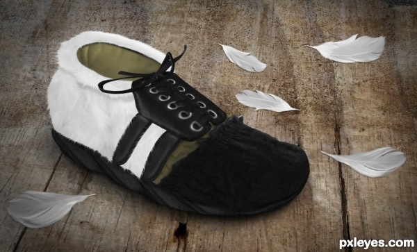
I created the shoe from feathers, leather and cloth from the source image and used the Transform, Smudge, Burn/Dodge tools and Blending Modes plus some techniques in mashing them together. It seems pretty safe to wear but I don't think it will last under the rain.
End result:
Step 1
I created a new document, 1951x1182 pixels with a 300 dpi resolution. The size need not be really large but I find it easier to work on the details this way.
NOTE: You can refer to the figure in Step 12 for the structure of the layers/groups of the shoe parts.
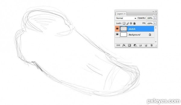
Sketch Layer
To start, I sketched a shoe on a new layer with a transparent background and renamed it to
sketch. This layer will serve as a guide on how I will place the shoe parts later on.
TIP: You can right click on the box containing the little eye icon on your layer and select a color for it. This can serve as a marker for your layers - in my case, it helped me easily identify the sketch layer whenever I need to toggle its visibility.
Step 2
This step will tackle the basic process of constructing the parts of the shoe and will be referred to in the next steps.
The first parts to be built are the
Shoe Tie (Shoelace), Rims and Shoe Tip Layers.
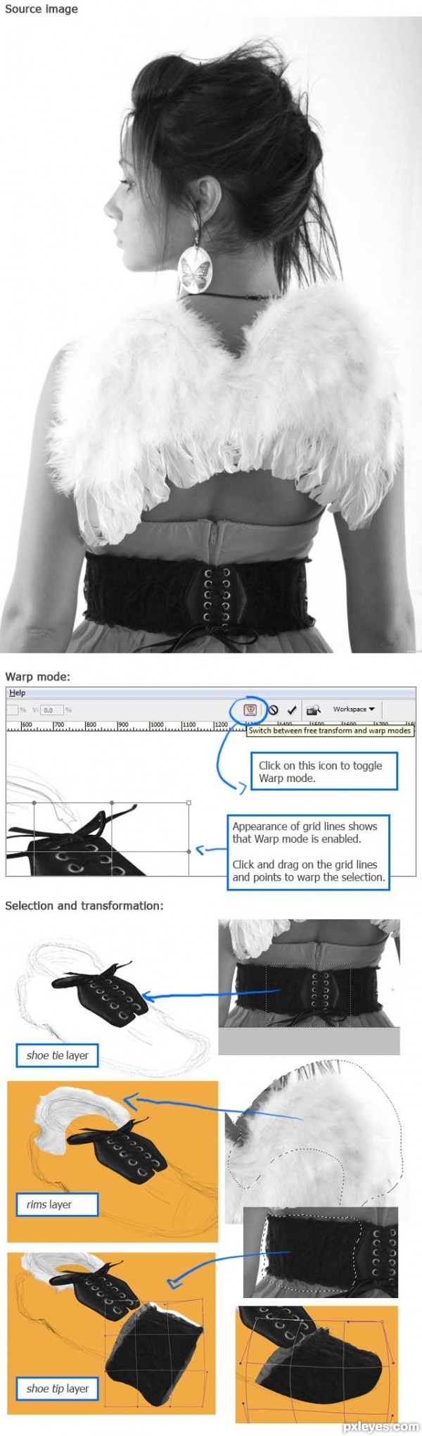
I opened the source image (from the Backview contest, http://www.pxleyes.com/photoshop-contest/18393/backview.html) in a separate document and selected areas from it by using the Marquee Tool (M). I
copied (Ctrl+C) the selection and pasted (Ctrl+V) it under the
sketch layer (
take note that I am keeping the sketch layer as the topmost layer).
I then
cleaned the selected area by masking the excess. I used Layer Masks in this step so that I can easily make adjustments later if needed.
Next, I
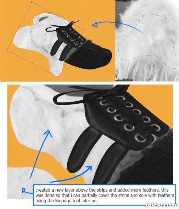
used the Transform tool (Ctrl+T) to adjust the position, size and perspective of the selected area/layer. To fit it more into the sketch I made earlier and to add some depth, I enabled the
Warp mode of the Transform tool. This can be done by clicking on the Warp icon on the Options bar (the Transform tool must be active to be able to use the Warp mode).
Note: I added an orange background since I find it difficult to manipulate the feathers against the white background.
TIP: If you wish to add a temporary background color (which you may want to change from time to time), rather than creating a new layer and filling it with the Paint Bucket Tool, you can click on the Adjustment Layer icon at the bottom of your Layers panel and select
Solid Color... (or via the menu,
Layer >> Change Layer Content >> Solid Color...). You can see more details about Adjustment Layers at Step 8.
Step 3
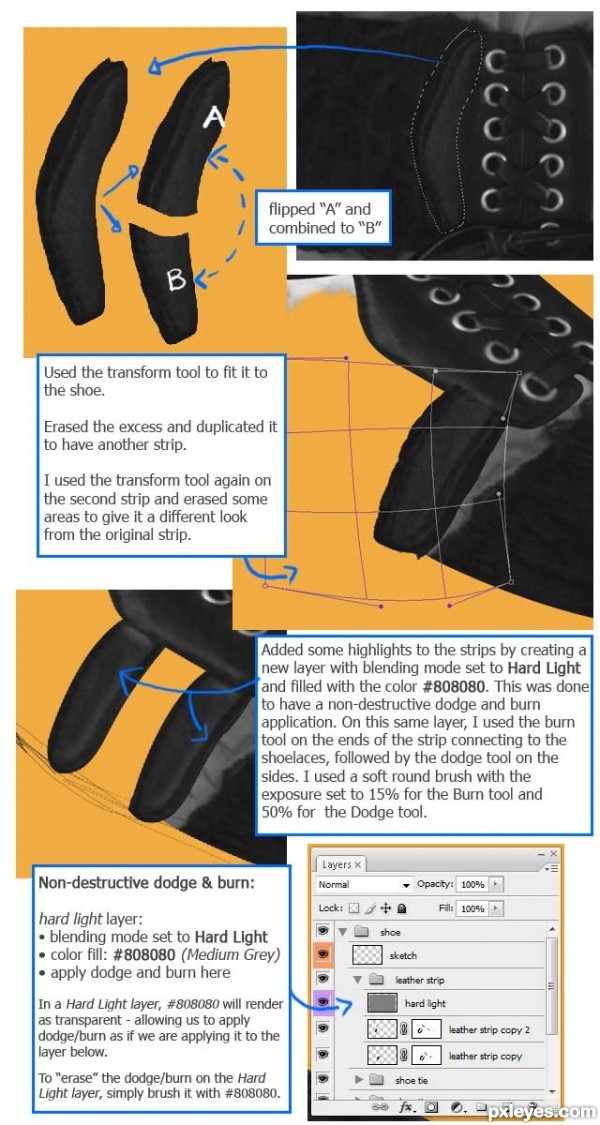
Leather Strip Layer
Using the same process in
Step 2, I proceeded to add leather strips to the side of the shoe.
At this point, I was already having a bunch of layers so that I grouped them by parts.
Step 4
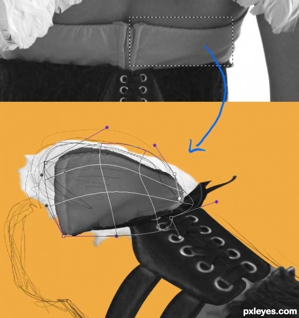
Insides Layer
Applying the process in
Step 2, I added the insides of the shoe.
Step 5
Body Layer
Added the rest of the body of the shoe.
Step 6
Sole Layer
Next, I added a sole to the shoe.
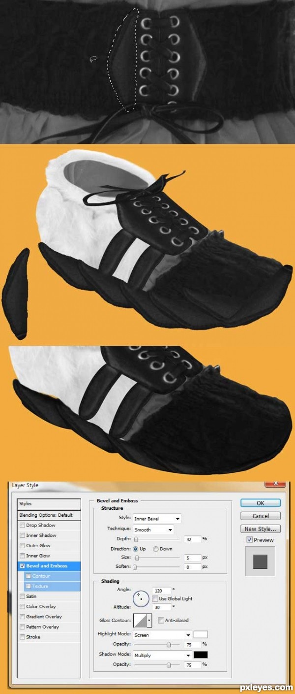
I first selected an area from the source photo then duplicated (Ctrl+J) it and formed it around the base of the shoe using the Transform tool (Ctrl+T).
I later cleaned the shape by flattening these strip layers and erasing the excess. I then moved it behind the rest of the layers.
And to give it some depth, I added a Layer style and selected
Bevel and Embossed (see settings below).
I then
added some shadows at the edges of each of the strips by painting it in with a soft round brush on a new layer with its blending mode set to Multiply. The colors I used for the shadows are varying shades of grey (
Note: I used this method of adding shadows throughout the next steps).
TIP: Another way to duplicate the current layer, is to use the Move tool (V), hold down the Alt key and then drag. This is suitable if you do not need the duplicate to be at the exact position of its copy - like in this step - otherwise, use Ctrl+J.
Step 7
Added more details to the body of the shoe.
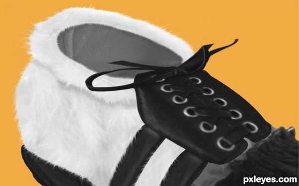
To give it a more feathery look, I used the Smudge tool (R) around the edges. With the strength set to around 60% to 80% and the brush size set from 2px to 4px, I made short quick strokes along the sides of the body.
I gave a range of values for the strength and brush size because I changed these settings from time to time as I applied the Smudge tool (R). This way, the strands will have varying thickness and length.
Going back to the extra layer of feathers I mentioned in
Step 5, I also applied this same technique to it and added some strands overlapping the strips of leather and sole.
I also added a shadow under the rim (
rims layer) of the opening of the shoe using the same technique I used on the sole (Step 6).
Step 8
Added details to the insides of the shoe.
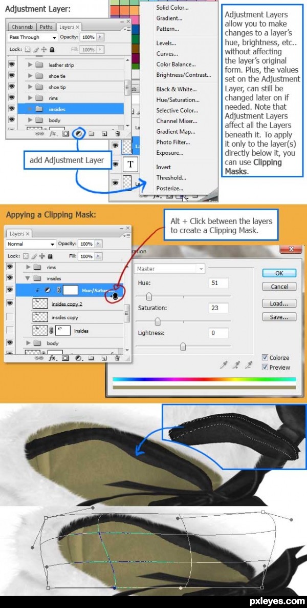
Added colors to the insides of the shoe using the Hue/Saturation adjustment layer. To prevent the Hue/Saturation Layer from affecting the layers below the
insides layer, I used the
insides layer as a
Clipping Mask.
I then added a few more details by placing a lining at the inside of the shoe using the same strip of leather used for the sole (again, the same process from Step 2 was used) plus some shadows (see Step 6).
Step 9
In this step, I fixed the
shoe tie layer and added color to the
shoe tip layer.
For the
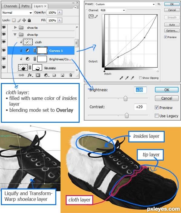
shoe tie layer, I masked more areas of the shoelaces and made the ends a bit rounded. I used Liquify to add some curl to the end of the shoelace and more Warp on the entire shape.
Next, in the
shoe tip group, I added some adjustments to the Curves and Brightness/Contrast of the
tip layer to blend it with the rest of the shoe, and again set a Clipping Mask so as not to affect the layers beneath.
I also added some color to the body of the shoe.
- First, I added a new layer which I renamed to
cloth
- On the
cloth layer, I marked the area of the shoe I would like to color using the Pen Tool (P) then converted it to a selection (Ctrl+Enter) - this being the non-black area of the
tip layer.
- Still on the
cloth layer, I used the Eyedropper tool on the
insides layer, then filled the selection using the Paint Bucket Tool.
- I removed the selection (Ctrl+D) and set the layer's blending mode to Overlay.
- To remove any excess color, I simply applied the Clipping Mask.
TIP: When using the Brush or Paint Bucket/Gradient tool, you can easily switch to the Eyedropper tool by holding down the Alt key.
Step 10
Background Group: Floor and Floor Overlay Layers
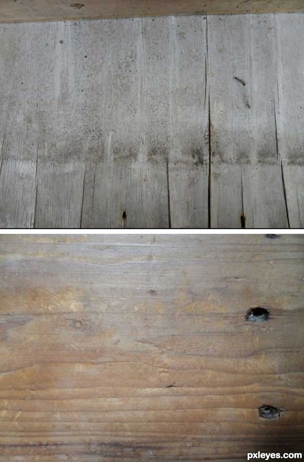
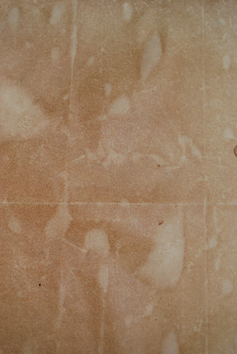
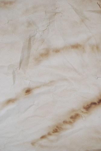
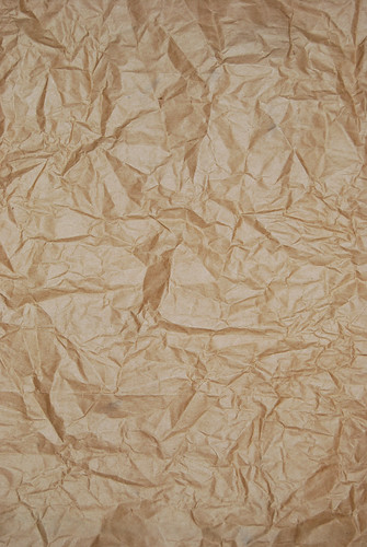
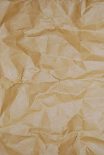
The following are my own photos used for the background.
Step 11
Background Group: Floor and Floor Overlay Layers
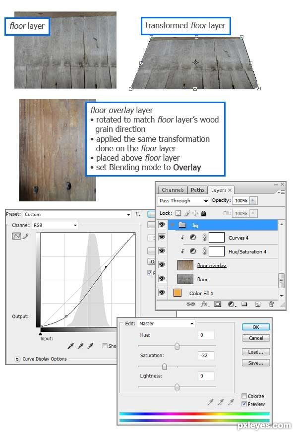
For the background, I used two layers. The
floor layer served as my main background and the
floor overlay layer, was used as a texture by setting it on top of the
floor layer and changing its blending mode to
Overlay.
I also adjusted the Curves and Hue/Saturation to darken the texture's colors. Again, I applied a Clipping Mask to prevent it from affecting the layers beneath.
Step 12
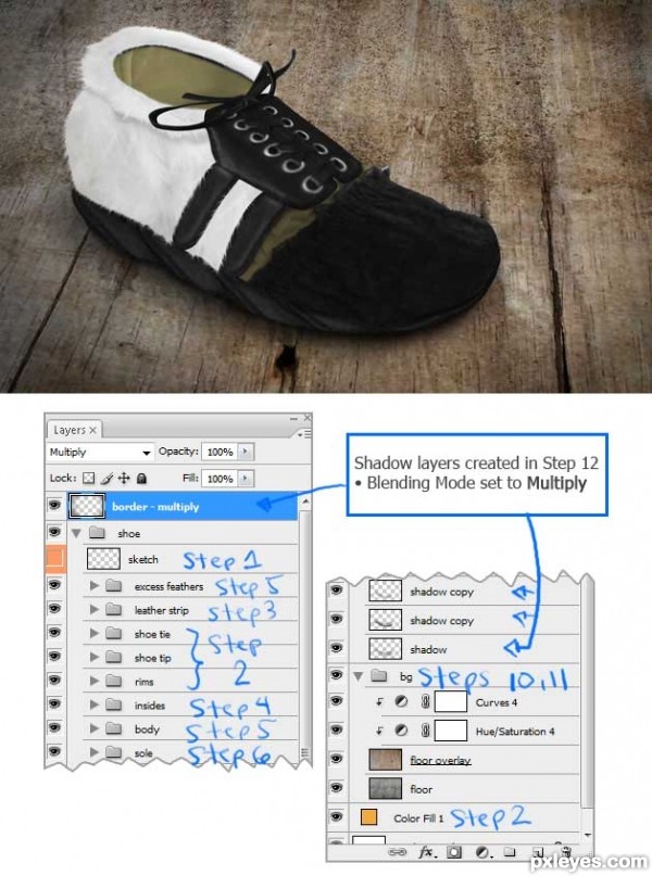
Added the background and placed a shadow beneath the shoe.
For the shadow, similar to the method used in
Step 6, I used a new layer with its blending mode set to
Multiply and brushed along the edges using a large soft brush with opacity set to around 45%. I duplicated the layer (Ctrl+J) several times and erased the too-dark-areas with a soft round brush and opacity set to 80%.
I created another Mulitply layer and set is as the topmost layer (Ctrl+Shift+}). Using the same method for the shadows, I made a circular border to somehow darken up the mood.
Below is the result and breakdown of layers and steps we have tackled so far.
Step 13
Added a few more details to the background.
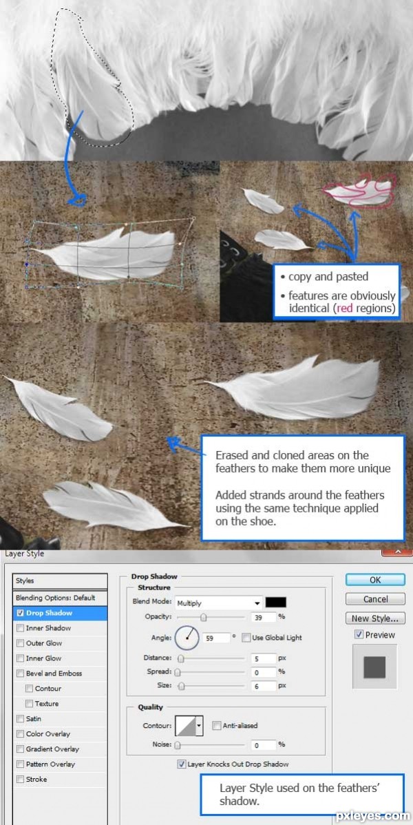
I first selected a feather that I can work with from the source image and pasted it just above the background layer (again, using the same process in Step 2).
I duplicated this feather several times and changed their position and sizes accordingly. To eliminate the copy-paste-look, I erased and cloned areas in each of the feathers to make them unique.
Using Layer masks, I removed some of the feather's edges with a soft brush and added a few gaps between the strands. I also adjusted the brush size and opacity from time to time while applying the mask.
For the Cloning (Clone Stamp tool, (S)), I lowered the opacity to 80% and cloned away obvious features of the feathers.
To make up for the erased edges of the feather, I added few strands along the sides using the same method in
Step 7. But this time, with a much smaller brush size.
And lastly, I added a shadow beneath the feathers using Layer Styles >> Drop Shadow.
I repeated this step once more using a different feather from the source.
Step 14
Some additional adjustments.
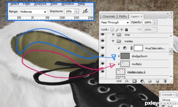
The inside of the shoe was looking kinda flat (many thanks to pixelkid for pointing this out ) so I added some shadows and highlights to it.
Using the
non-destructive dodge/burn method (see image in Step 3), I added some wrinkles beneath the lining of the
insides layer. Using
Midtones as the Range for both tools, I set my exposure to 15% for the Burn tool and 10% for the Dodge tool (you can see these settings at the Options bar).
As for the shadows on the lower part of the
insides layer, similar to the previous steps, I created a Multiply layer and brushed in dark areas using a large soft brush with opacity around 10% to 15%.
TIP: For tools having the same shortcut key, use Shift+Shortcut_Key to easily switch between tools. So for the Burn and Dodge tools, use Shift+O, or for the Paint Bucket and Gradient Tool, use Shift+G.
Step 15
And this ends the tutorial. Hope you find this helpful. Cheers!


 Posted in: